Every day, we encounter brand logos—on billboards, product packaging, websites, and more. While some logos are straightforward, others hide layers of meaning that aren’t immediately obvious. Many logos contain symbols, subtle messages, and design elements carefully chosen to make the brand memorable. Today, let’s dive into the fascinating world of hidden stories and secrets behind some of the world’s most famous logos.
1. Tesla: A “T” with Multiple Meanings
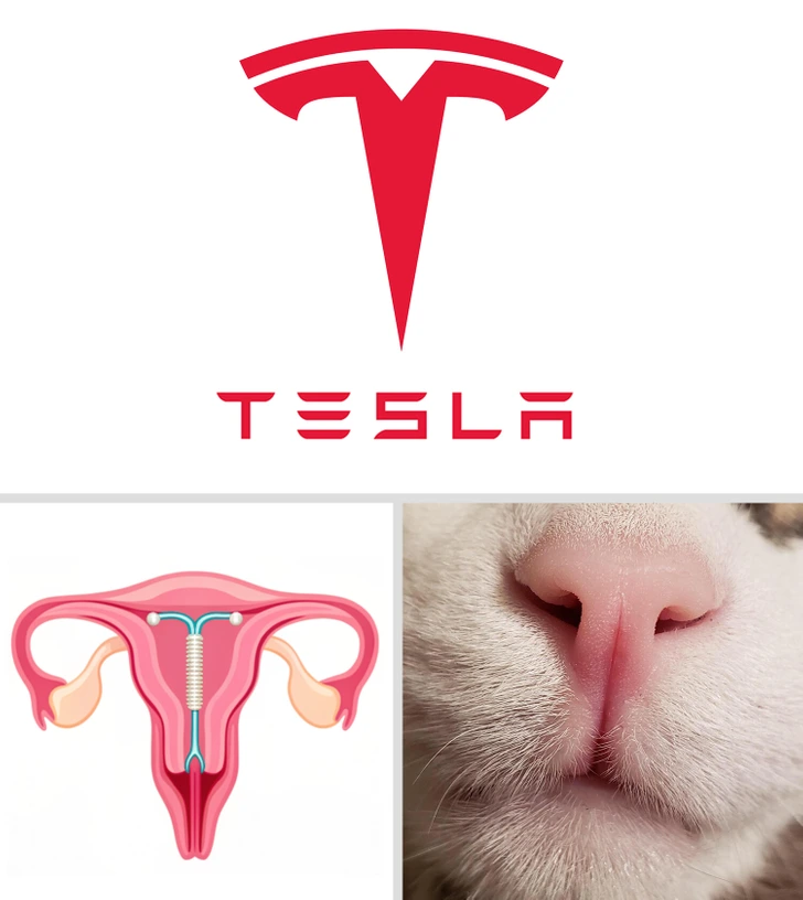
The Tesla logo is a sleek, modern “T,” which many people see as a simple representation of the brand’s name. But take a closer look, and you’ll notice that the shape could resemble more than just a letter. Some say it looks like a cat’s nose, while others compare it to an IUD, given its shape. However, the most widely accepted interpretation is that the Tesla “T” also represents a cross-section of an electric motor, subtly nodding to the innovation behind the brand’s electric cars.
2. The Friendly Face of Uncle Ben’s
Uncle Ben’s, a well-known brand for parboiled rice, has a warm, familiar face on its packaging—a friendly older gentleman in a bow tie. The story goes that this face is based on Frank Brown, a maître d’hôtel in Chicago whom the company’s founders met in the 1940s. Brown’s warm and approachable demeanor left such an impression that they decided to use his face as their brand’s icon, embodying qualities of trust, warmth, and tradition in every box of rice.
3. Amazon: More Than Just a Smile
Amazon’s logo is recognized worldwide for its simplicity and clever design. At first glance, it appears to be a smile, with an arrow pointing from “A” to “Z.” But this seemingly simple logo packs a punch in terms of hidden meaning. The smile represents customer satisfaction, while the arrow from “A” to “Z” hints at the idea that Amazon offers everything you could possibly need, from A to Z. It’s an understated yet powerful way to communicate the brand’s vast selection and commitment to happy customers.
4. Hershey’s Kisses: A Hidden Sweet Treat
Hershey’s Kisses has a logo with an unexpected surprise. If you look between the “K” and “I” in “Kisses,” you’ll notice a small, Hershey’s Kiss cleverly hidden in the negative space. This subtle design element delights fans of the brand and reinforces the product’s playful, whimsical nature. It’s a small detail that adds a dash of charm to the iconic chocolate brand.
5. Quiksilver’s Great Wave Inspiration
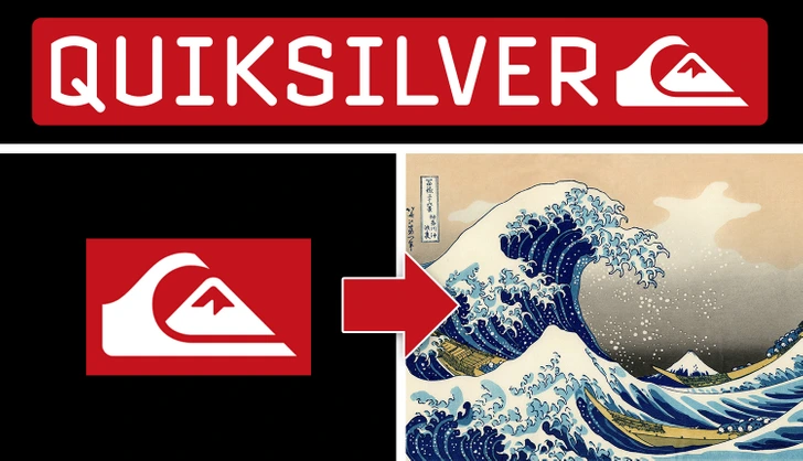
Quiksilver, the renowned surfwear brand, features a logo with a bold, dynamic wave and a mountain. This design was inspired by the famous Japanese woodblock print, The Great Wave off Kanagawa, created by artist Hokusai. The logo reflects the spirit of adventure and connection to nature, fitting perfectly with the brand’s image as a go-to choice for surfers and outdoor enthusiasts.
6. Versace: The Hypnotic Power of Medusa
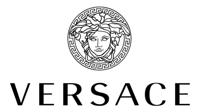
Versace’s logo features Medusa, a character from Greek mythology known for her beauty and deadly allure. Gianni Versace chose Medusa because of her captivating power—those who looked at her were enchanted. By using Medusa as the logo, Versace aimed to evoke the same sense of allure, hoping that people would be irresistibly drawn to his clothing and designs. It’s a symbol of luxury, beauty, and danger, all wrapped into one iconic image.